Wednesday, October 8, 2008
Tuesday, October 7, 2008
Tuesday, September 30, 2008
Monday, September 29, 2008
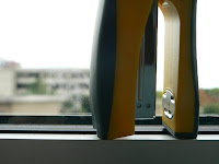
 In this one I turned the stapler sideways and placed it on my windowsill for the landscape kind of background behind it. I chose a smaller aperture for less depth of field so the focus would be on the object. It also isn't centered, but the buildings in the background and the part of the windowsill on the bottom help to balance the picture.
VIsual Language Photos: Balance
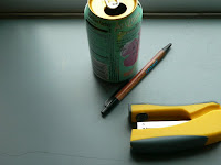
For this assignment, I chose to photograph my stapler. I wanted to use a normal, everyday kind of object as opposed to something that might be considered cliche. I chose balance to be my principle. I started off as basic as I could, placing my subject exactly in the middle of my photograph. Then I started creating slightly more complicated compositions using other objects. For most of the time I had the camera set to manual so I could play around with the settings. The second half of the assignment was harder for me. I'm so used to automatically trying to make things look good that making them deliberately bad is difficult. I tried to photograph my stapler in situations that were more off-balance, and only succeeded half the time. It was hard for me to visualize off-balance compositions.
Subscribe to:
Posts (Atom)


